How to Choose the Right Color Scheme for Your Home
Choosing the right color scheme for your home can be one of the most rewarding—and daunting—parts of interior design. Colors influence mood, perception, and functionality, and they reflect your personality. A well-chosen palette can transform a dull space into a warm sanctuary, a modern oasis, or an artistic statement.
In this article, we’ll break down how to select the perfect colors for your space based on psychology, lighting, room function, and style preferences. Whether you’re redecorating a single room or refreshing your entire home, this guide will help you do it with confidence and creativity.

- Understanding Color Psychology
Color psychology explores how hues affect human emotions and behavior. Here are a few basics to consider:
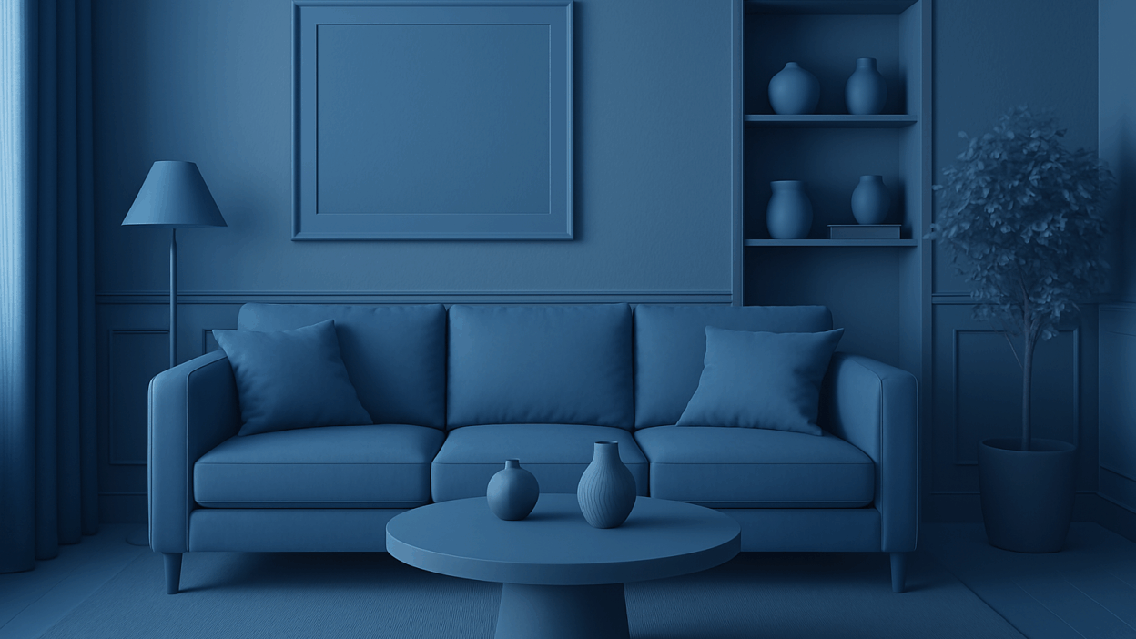
- Blue: Calming, promotes relaxation (ideal for bedrooms and bathrooms)
- Red: Stimulating and energetic (great for dining rooms or creative studios)
- Green: Refreshing and balanced (works well in living rooms or offices)
- Yellow: Cheerful and optimistic (good for kitchens and breakfast nooks)
- Gray: Neutral and sophisticated (popular in modern and minimalist designs)
- Start With a Base Color
A good strategy is to start with a single dominant color—your “anchor”—then build around it.
Ask yourself:
- What color do you gravitate toward naturally?
- Is this color present in a piece of furniture or artwork you love?
- Does it fit the room’s lighting and use?
Once you have your base, create harmony with complementary or analogous tones.
- Consider Natural and Artificial Lighting
Lighting has a massive impact on how color looks. A shade of gray may appear blue in natural daylight but beige under warm artificial light.
Natural Light
- North-facing rooms: Cool and consistent, best suited for warm colors.
- South-facing rooms: Bright and warm, ideal for cooler shades.
- East-facing rooms: Morning light is warm; afternoons are cooler.
- West-facing rooms: Warm in the evening, best for soft, neutral tones.
Artificial Light
- LED: Varies by temperature (cool white vs warm white)
- Incandescent: Warm and yellowish, ideal for cozy vibes
- Fluorescent: Bluish tone, more suitable for workspaces
Image suggestion: A comparison of the same paint color in different lighting conditions
- Define the Room’s Function and Mood
Color should reflect the purpose of the room. Consider the following:
- Living Room: Sociable and relaxing → Try earthy tones or soft neutrals
- Bedroom: Tranquil and restful → Cool blues, muted greens, soft purples
- Kitchen: Bright and energizing → Yellows, whites, even reds
- Home Office: Focused and productive → Greens and neutral grays
Match the color to the energy you want to cultivate in that space.
Image suggestion: Four rooms side-by-side with mood-appropriate color palettes
- Use the 60-30-10 Rule
This rule is a classic in interior design:
- 60%: Dominant color (walls or large furnishings)
- 30%: Secondary color (upholstery, drapes, bedding)
- 10%: Accent color (art, pillows, accessories)
It keeps the space visually balanced and allows flexibility for trends and personalization.
Image suggestion: Diagram of the 60-30-10 rule applied to a living room
- Understand Warm vs Cool Colors
Warm Colors
- Red, orange, yellow
- Feel cozy and stimulating
- Best for social spaces or cooler climates
Cool Colors
- Blue, green, purple
- Calming and refreshing
- Great for relaxing environments or warm climates
Mixing both types creates visual interest. For instance, pair a warm-toned sofa with a cool-toned rug.
Image suggestion: A side-by-side swatch of warm and cool color schemes in interiors
- Test With Samples
Always test before you commit. Paint samples on a large area of your wall and observe them at different times of the day.
Tips:
- Use at least a 12×12 inch patch
- Check it under both natural and artificial lighting
- See how it pairs with furniture, flooring, and decor
You can also use peel-and-stick sample swatches that are removable and mess-free.
Image suggestion: A photo of swatches tested on a wall in various lighting conditions
- Color Trends vs. Timeless Hues
It’s tempting to go with the “Color of the Year” from Pantone or major paint brands—but trends fade. Consider mixing trendy shades in your accents and keeping the base timeless.
Timeless Choices:
- Whites and off-whites
- Soft grays and taupes
- Navy blue and sage green
- Greige (a gray-beige hybrid)
Image suggestion: A collage of timeless vs trendy interiors side by side
- Digital Tools to Help You Choose
There are fantastic apps and online tools that can make this process easier:
- Sherwin-Williams ColorSnap: Preview paint in real rooms
- Benjamin Moore Color Portfolio App: Visualizer and AR tool
- Coolors.co: Generate complete palettes from one color
- Pinterest & Canva: For inspiration boards
Upload your room photo and try different hues before making a final choice.
Image suggestion: Screenshot of one or two apps in action
- Final Tips and Common Mistakes to Avoid
✅ Do:
- Start with what you love (a favorite fabric, painting, or rug)
- Factor in lighting, function, and existing furnishings
- Stick to a consistent palette throughout connected rooms
- Use accents to add variety without overwhelming the space
❌ Don’t:
- Paint all walls a bold color—use it as an accent instead
- Ignore undertones (some whites are blueish, some are creamy)
- Rely only on swatches—test full-size samples
- Forget the ceiling—sometimes a tinted ceiling adds depth
Image suggestion: A “dos and don’ts” side-by-side graphic
Conclusion
Choosing a color scheme is more than picking your favorite shade—it’s a combination of science, psychology, and art. It’s about creating harmony, enhancing space, and setting the tone for how your home feels day after day. Don’t rush the process. Start small, test your ideas, and most importantly—have fun!
